 By James
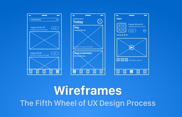
Ten years ago, I sat in a boardroom watching a founder pitch a “revolutionary” fintech app. The slides were gorgeous—high-fidelity mockups with vibrant gradients and perfect typography. Six months and $150,000 later, the app launched. It was a disaster. Users couldn’t find the “Send Money” button, the navigation felt like a labyrinth, and the churn rate was a nightmare.
The problem? They started with the “paint” before they built the “foundation.” They skipped the app wireframe design phase, or rather, they treated it as a formality. In my decade of consulting, I’ve seen this mistake more than any other.
Think of a wireframe as the architectural blueprint of a house. You wouldn’t pick out the velvet curtains before you knew where the load-bearing walls were, right? Let’s dive into how to build blueprints that actually work.
Why Most Beginners Fail at App Wireframe Design
The most common trap for beginners is the “Dribbble Effect.” We see beautiful, polished designs online and want to jump straight into Figma to play with shadows and colors.
When you focus on aesthetics too early, your brain stops solving functional problems. You start making decisions based on what looks “cool” rather than what makes sense for the user’s thumb. App wireframe design is about skeletal structure, not skin. It is the bridge between a raw idea and a functional product.
The Low-Fidelity Mindset
I always tell my team: “If it takes more than 10 minutes to explain, the wireframe is too complex.” Your goal is to map out the User Journey. If a user needs to get from Point A (Login) to Point B (Checkout), how many obstacles are in their way? Wireframing allows you to find those obstacles without wasting a single line of code.
1. Master the Visual Hierarchy (The “Squint Test”)
One of my favorite “Pro Tips” is the Squint Test. Open your wireframe, lean back, and squint your eyes until the text becomes a blur. What stands out?
-
The biggest elements should be your primary Call to Action (CTA).
-
The layout should guide the eye in an “F” or “Z” pattern.
-
Whitespace isn’t “empty space”—it’s a tool to prevent cognitive overload.
In app wireframe design, we use different shades of gray to represent hierarchy. A dark gray box suggests a primary button, while a light gray outline suggests a secondary action. This teaches the user’s brain what to prioritize before they ever see a brand color.
2. Real Content Over “Lorem Ipsum”
Here is a hidden warning: Lorem Ipsum is the enemy of good UX. I’ve seen layouts look perfect with three lines of “Latin” text, only to break completely when the real marketing copy—which was actually eight lines long—was plugged in. Use real data or “proto-content.”
-
Names: Use “Jonathan Doe” instead of “Name.”
-
Prices: Use “$199.99” instead of “$X.XX.”
-
Buttons: Use “Start Free Trial” instead of “Button Text.”
Using real content forces you to confront spatial constraints early. If the headline doesn’t fit in the wireframe, it won’t fit in the final app. Solve that problem now, not during the high-fidelity handoff.
3. Designing for the “Thumb Zone”
We often design on 27-inch monitors, but our users experience our work on a 6-inch screen held in one hand. This is where app wireframe design meets physical ergonomics.
The “Thumb Zone” is the area of a phone screen that a user can easily reach with their thumb while holding the phone one-handed.
-
Safe Zone: The bottom and middle-center of the screen. Put your main navigation and primary buttons here.
-
Danger Zone: The top corners. Reserve these for “destructive” actions (like Delete) or infrequent actions (like Settings), so users don’t trigger them by accident.
4. Navigation: Don’t Make Your Users Think
I’ve consulted for companies that tried to be “innovative” with their navigation—using hidden gestures or mysterious icons. Innovation in UX is often just a fancy word for confusion.
Stick to established mental models. Users expect:
-
A Bottom Tab Bar for primary app sections (3–5 items max).
-
A Back Button in the top left (on iOS) or handled by the system (on Android).
-
A Profile Icon in the top right.
Pro Tip: If you have to include a “Tutorial” just to explain how to navigate your app, your wireframe has failed. The interface should be an invisible guide.
5. Iteration: The Rule of Three
Never fall in love with your first wireframe. I practice the Rule of Three: for every core screen (like the Dashboard), I sketch three completely different layouts.
-
The Conventional Version: How do the competitors do it?
-
The Minimalist Version: What happens if I remove 50% of the elements?
-
The “Crazy” Version: If there were no technical limits, how would this work?
By comparing these three, you usually find that the best solution is a hybrid. It prevents you from getting “tunnel vision” on a mediocre idea.
Essential Vocabulary for App Wireframe Design
To communicate effectively with developers and stakeholders, you need to speak the language. Here are the LSI (Latent Semantic Indexing) terms you should know:
-
User Flow: The path a user takes through your app to complete a task.
-
Fidelity (Low vs. High): The level of detail and realism in a design.
-
Call to Action (CTA): The part of the screen that encourages the user to do something (e.g., “Buy Now”).
-
Information Architecture (IA): How information is organized and structured within the app.
-
Affordance: Visual cues that tell a user how to interact with an object (e.g., a button that looks “clickable”).
Common Mistakes to Avoid
| Mistake | Why it hurts UX | The Fix |
| Using Images | Distracts from the layout logic. | Use a box with an “X” through it to represent an image. |
| Too much detail | Stakeholders will comment on fonts instead of flow. | Keep it to grayscale, boxes, and lines. |
| Ignoring Edge Cases | What happens when there’s an error? Or no internet? | Design the “Empty States” and “Error States” during wireframing. |
| Pixel Perfection | Wastes time on alignment that will change later. | Focus on the ratio and relationship between elements. |
Summary: Building Your Blueprint
Successful app wireframe design is about empathy. It’s about putting yourself in the shoes of a tired, distracted user who just wants to get a task done. If your wireframe is clear, logical, and respects the user’s physical constraints, the “pretty” part of the design will fall into place naturally.
My Final Expert Advice: Don’t be afraid of the “ugly” phase. A messy sketch on a napkin that solves a user’s problem is worth more than a beautiful Figma file that confuses them.
What’s your biggest challenge when starting a new design?
Are you struggling with choosing the right navigation style, or is “blank canvas syndrome” holding you back? Drop a comment below or share this article with your design team—let’s start a conversation about building better digital experiences!